It was scary bad, in a Star Wars rip off way. It looks like the straight to video VHS cover of a bad sci fi movie! Awful, awful stuff. If I had to see a car or merchandise with that logo on it, I might stare at the sun.
Here is the new logo:
Look at the classic lines. The retro font. The colors, the shape and style! Man, I wish I had designed this. GET 3 needs a t shirt with this logo on it, stat!
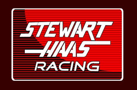
* after studying the logo again and again, something familiar came to mind. The font of the word "racing" is very familiar to me. I've seen it on the side of a race car before:
 Here's a more detailed image of the car:
2 comments:
I did know that the LOGO had changed. When they brought the Web site up that was the LOGO they went with.(back in Dec.) I too like the new LOGO better. Where you got me beat was where you saw the "racing' font.....You da shitz! I will have a hat when it gets off back order. I did not like the T-shirts. All of them have a crazy design behind the LOGO that I don't like. The hat just has the BAD ASS LOGO on it. Will get an Old Spice t-shirt too. They do have all of this at NASCAR store, but I'm not going to give them BASTARDS a penny. Ordering directly from StewartHaasracing.com. (I know it all comes from the same place, it is just a matter of F the NASCAR store.....LMFAO)
You better try and get a discount or we might have to look into intellectual property law!
Post a Comment